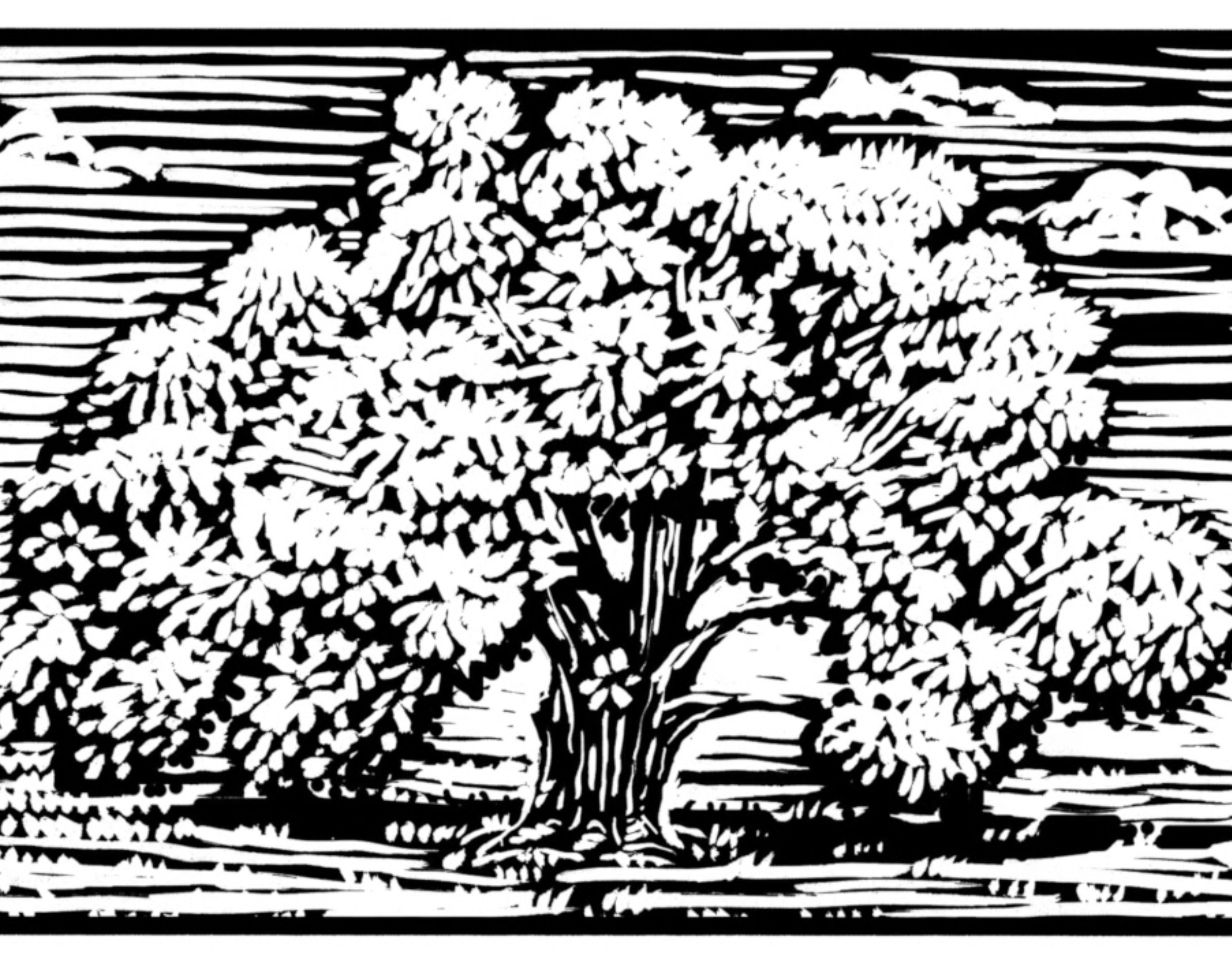
NMFMA Isometric Map
October, 2025
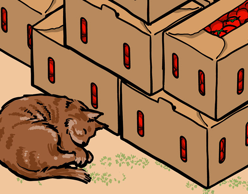
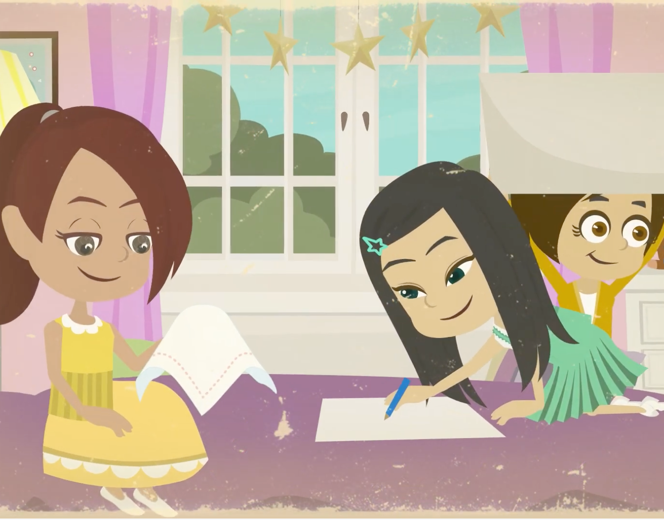
Under the Oak Tree in May illustrations
September, 2025
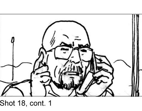
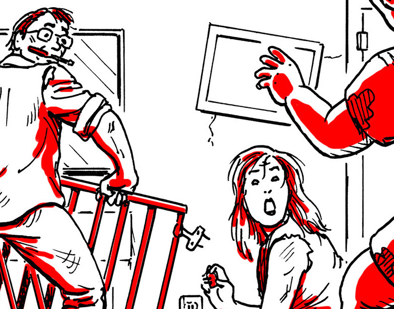
Film & TV Storyboards
December, 2017
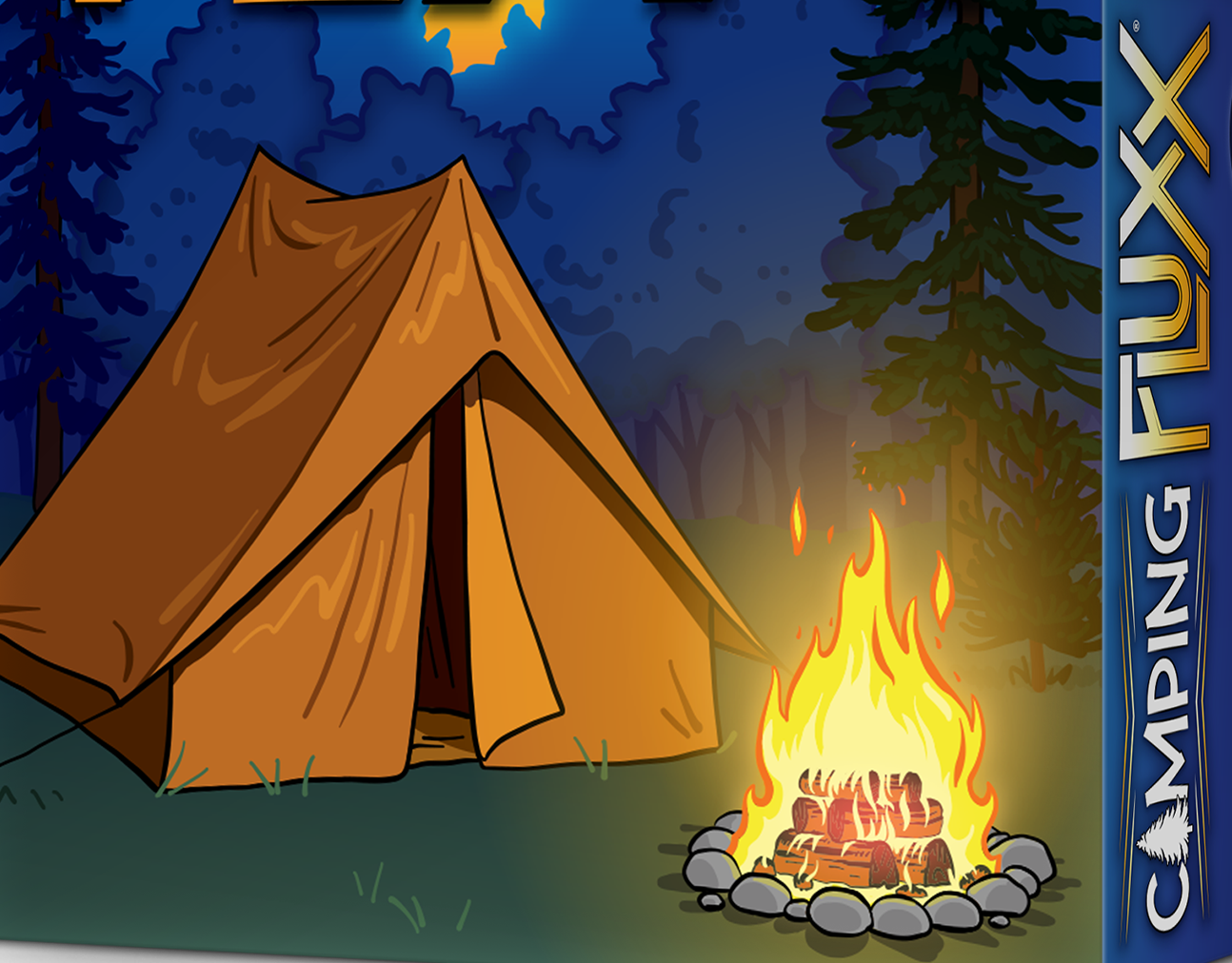
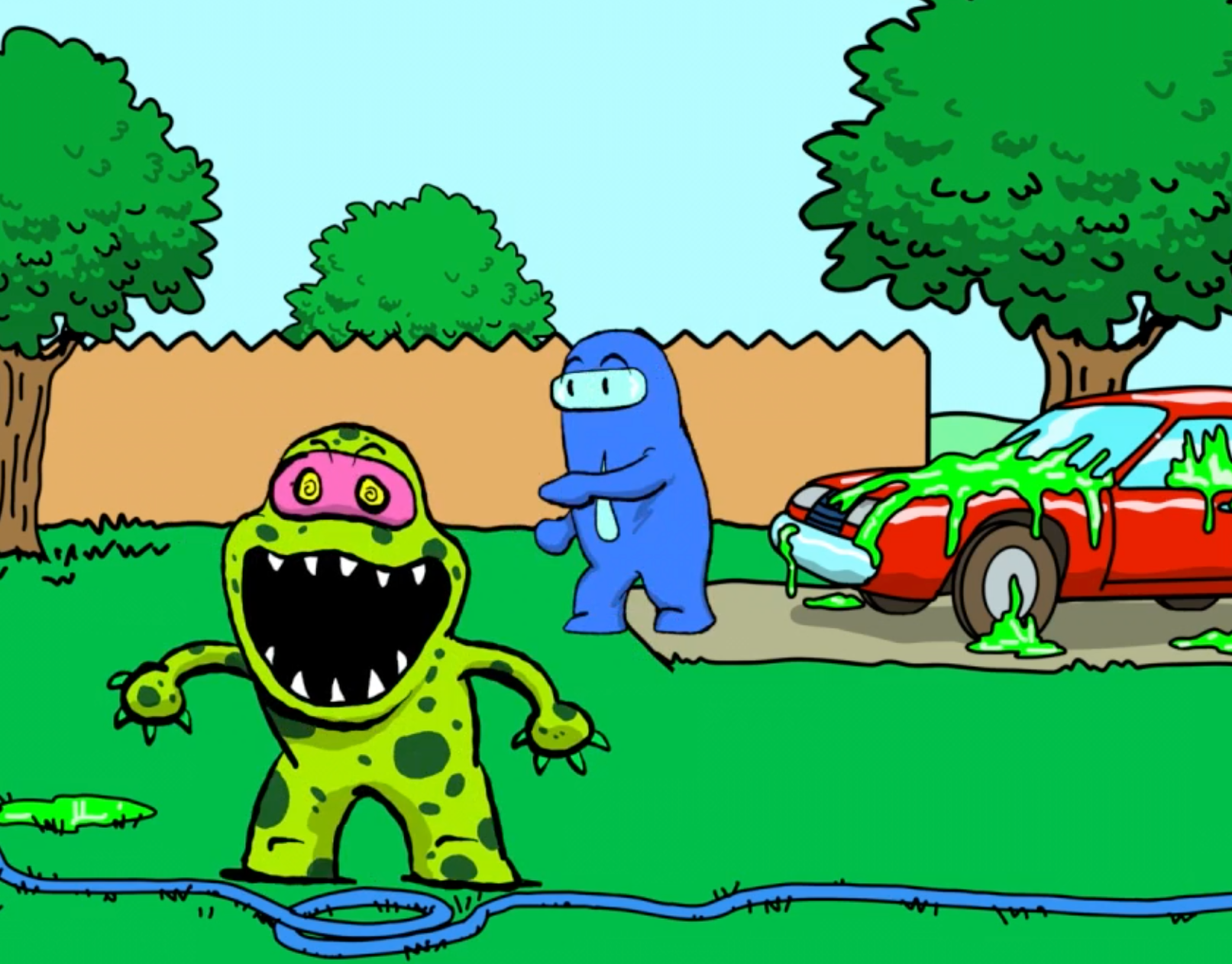
Camping Fluxx Illustrations
November, 2023
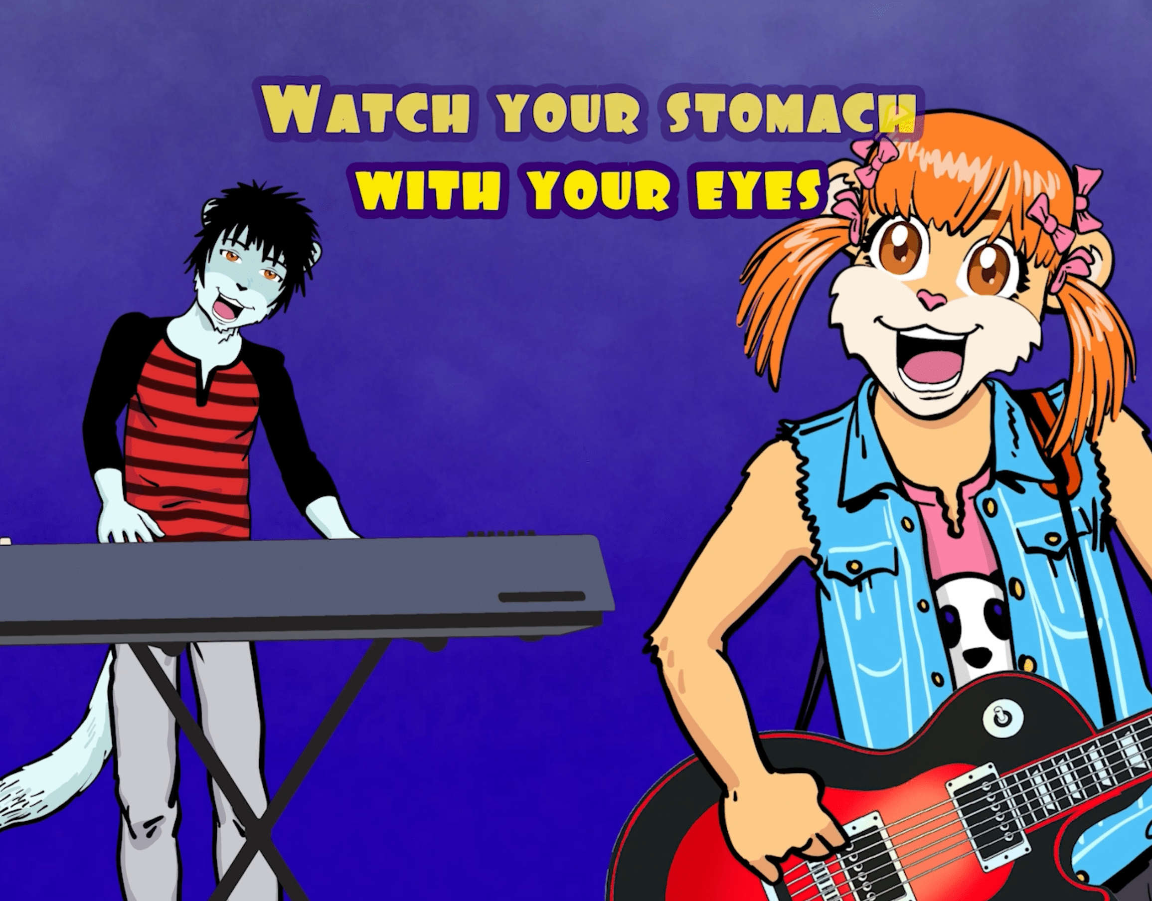
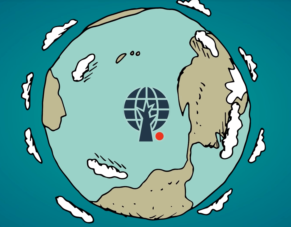
Educational/Explainer Animated Videos
August, 2023
"How to Be a Man" Book Illustrations
June, 2023
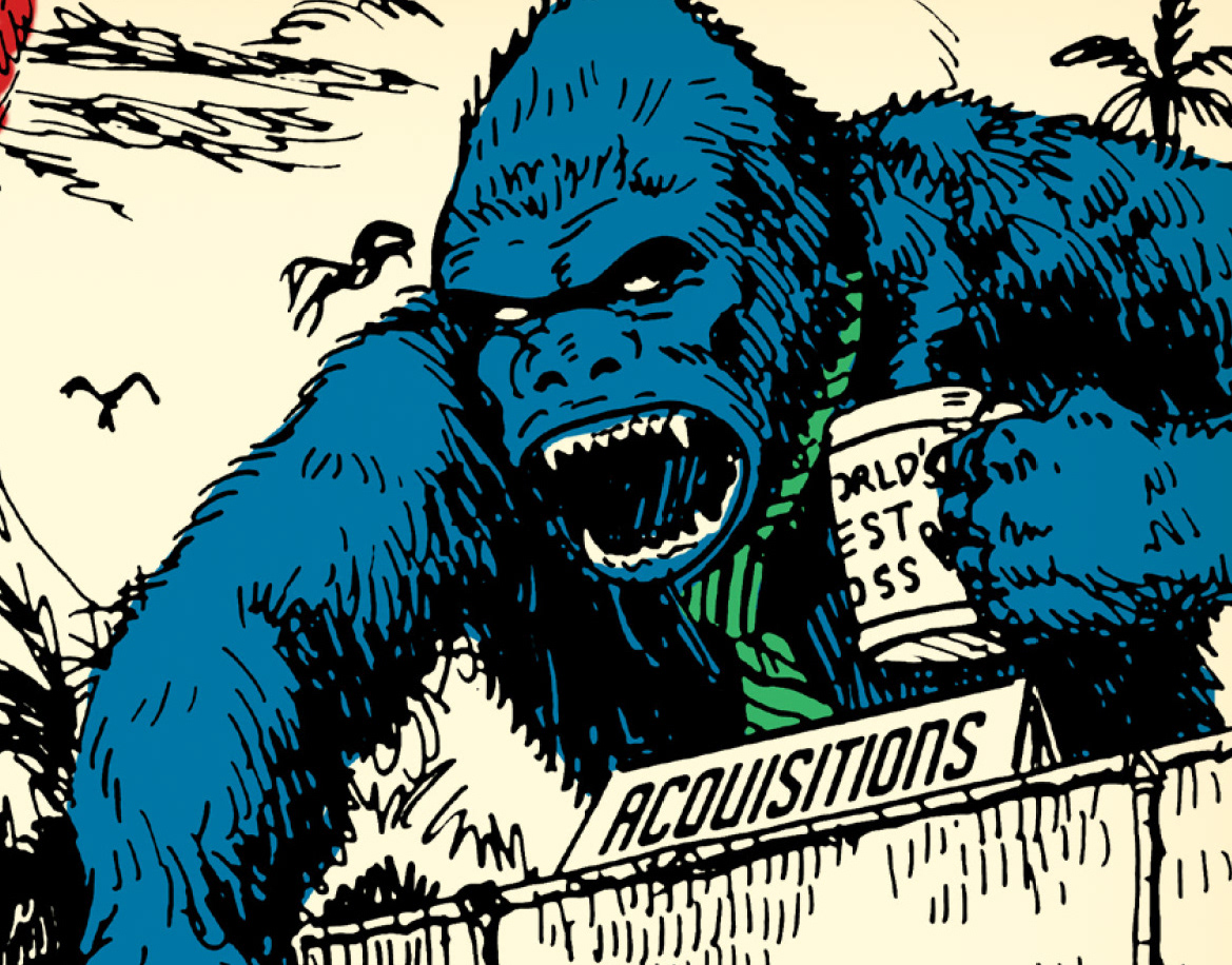
Energy Action Team Video Art
August, 2022
Animated Videos for Community Museum
August, 2022
Comics Work
September, 2020
Demo Reel
August, 2019
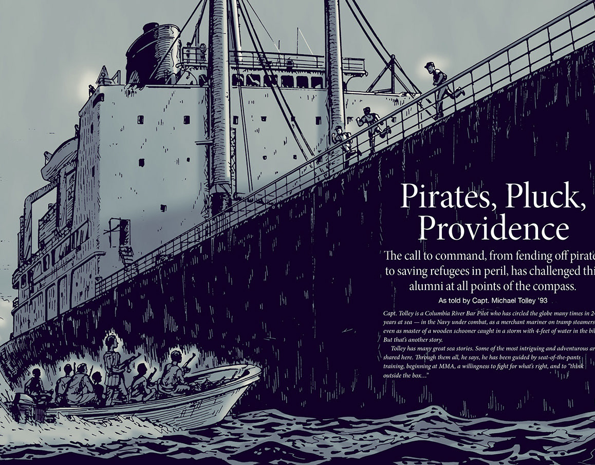
Pirates, Pluck, Providence
January, 2020
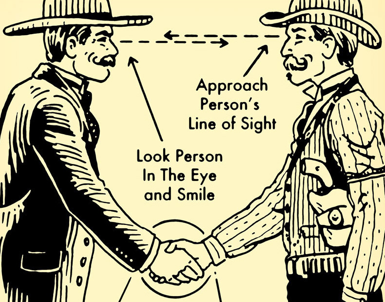
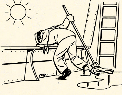
Art of Manliness illustrations
December, 2017
Jack Speak Illustrations
October, 2019
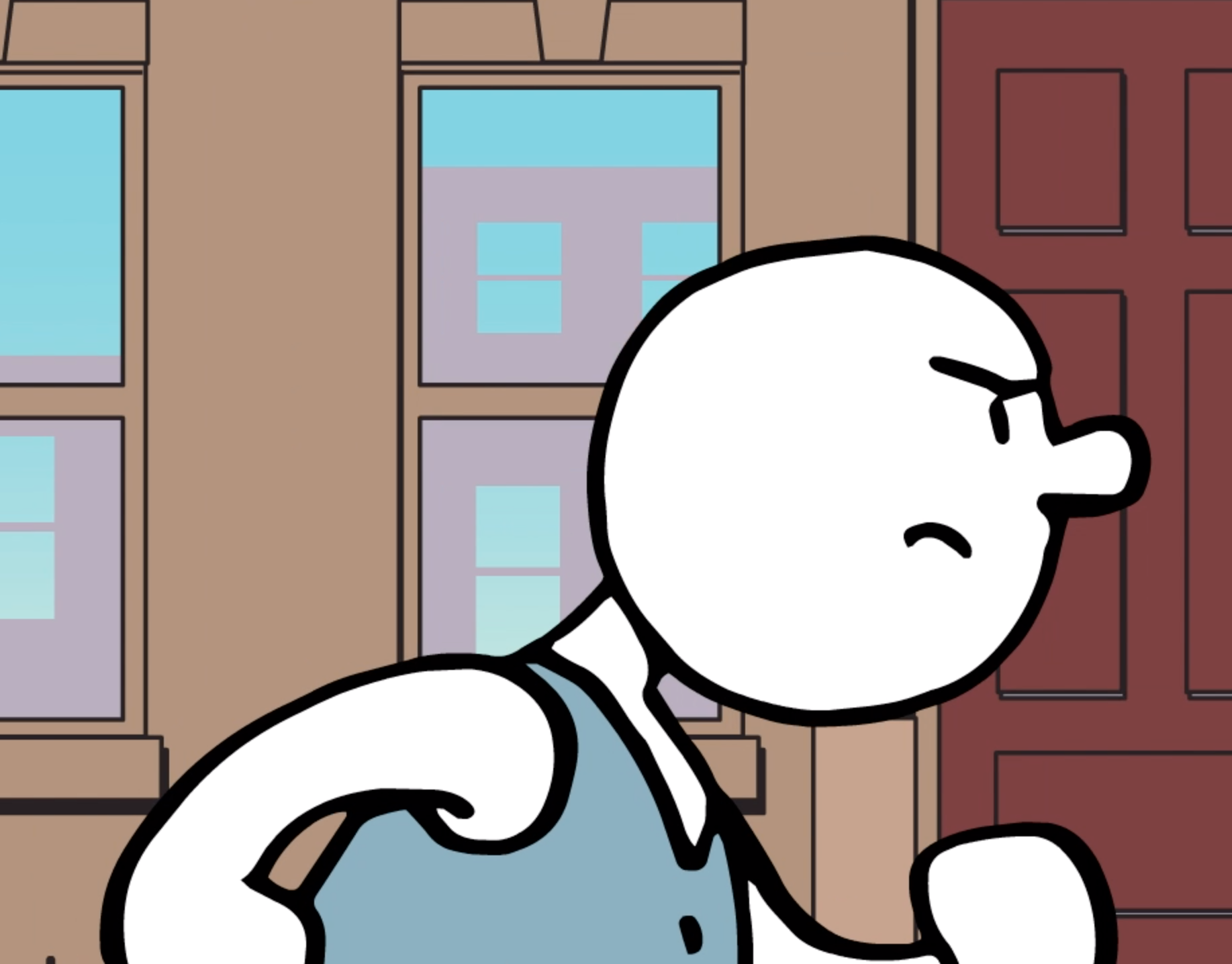
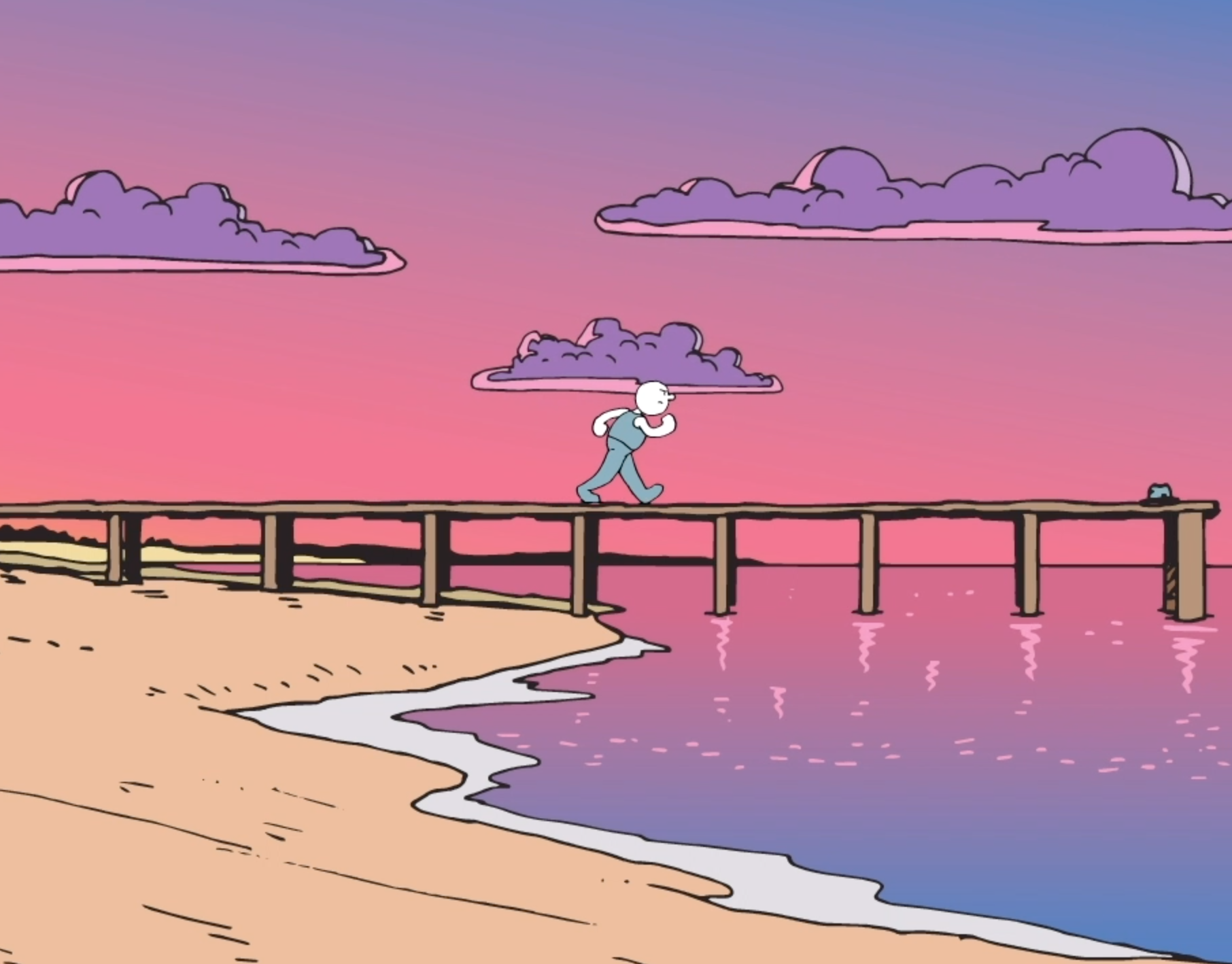
The Angry Walk
July, 2019
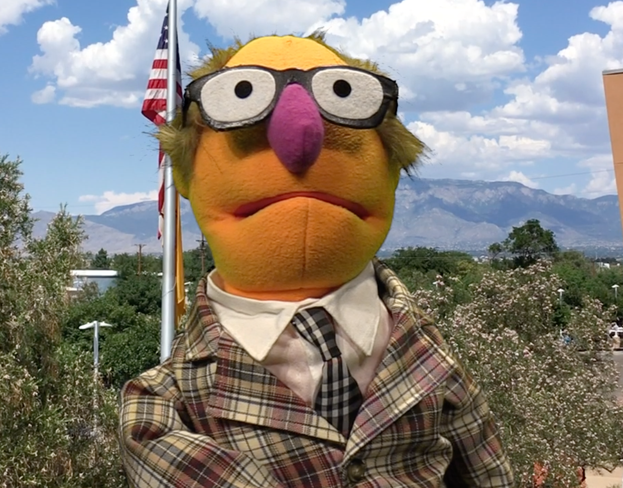
Frank Frankly video
July, 2019
NOBL Survival Guide
April, 2019
Gravity Drive Video Illustrations
April, 2019
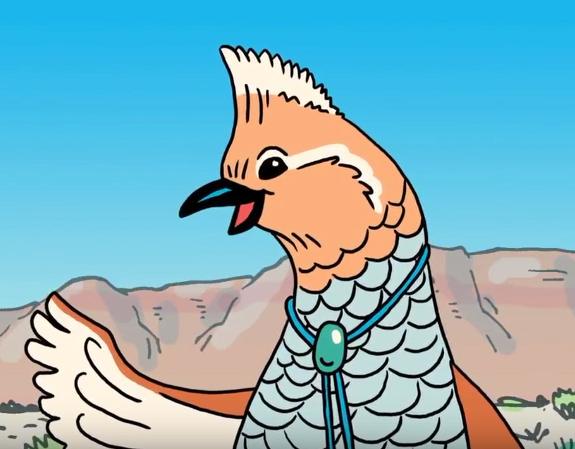
Respect Arroyos Video
October, 2018

Why You Need Storyboards
August, 2018

Alpine A110 Driving Tips
August, 2018
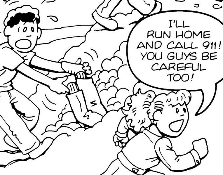
100 Deadly Skills
April, 2018
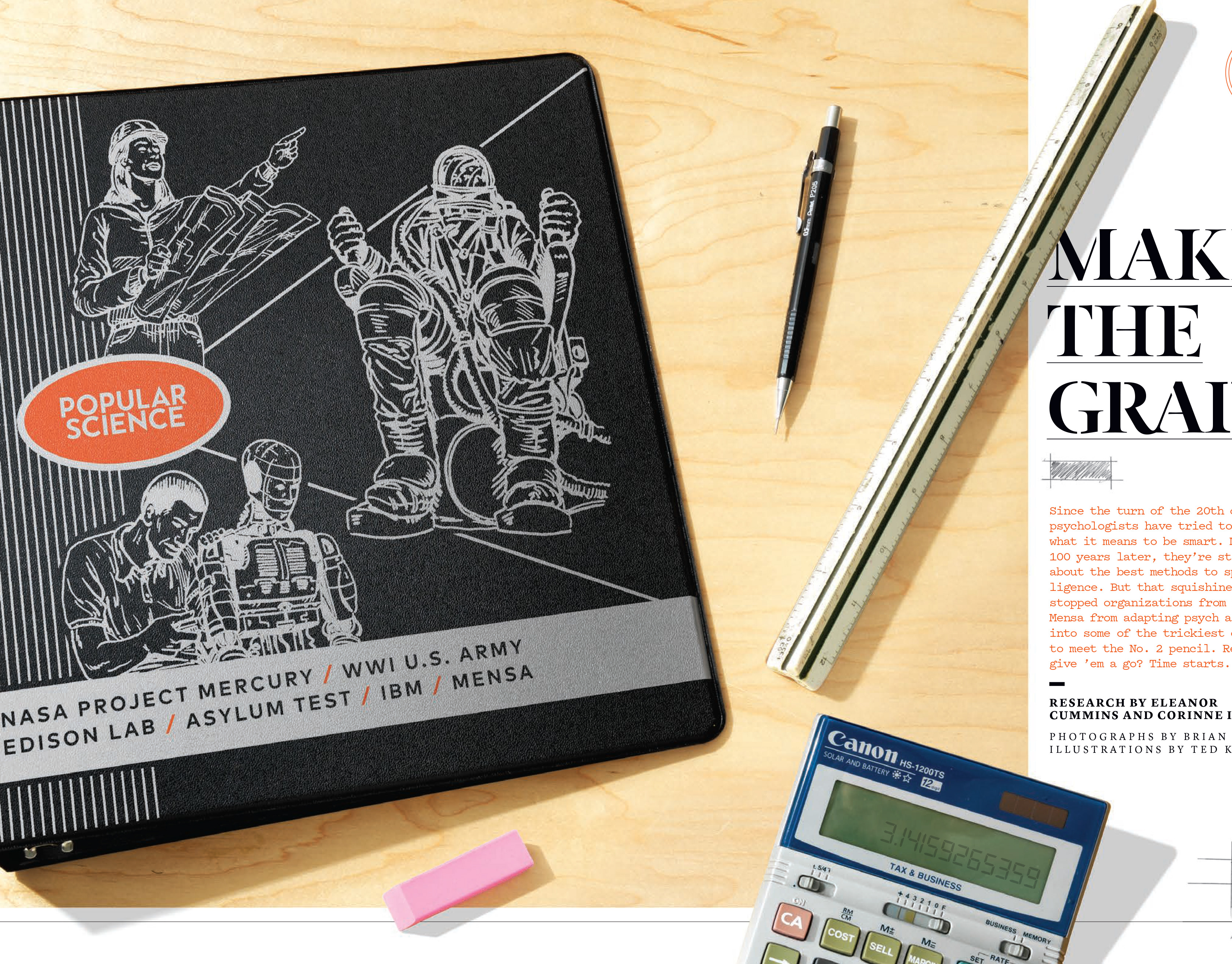
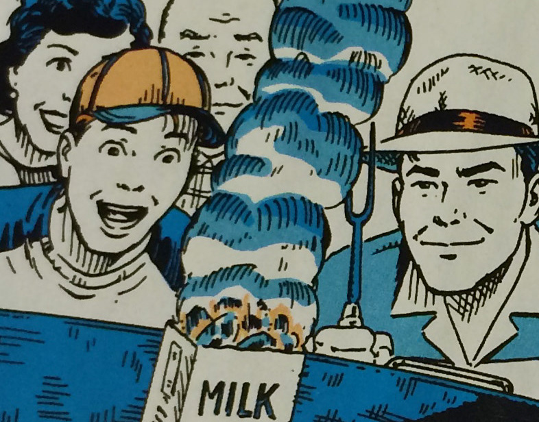
Popular Science: Make the Grade
March, 2018
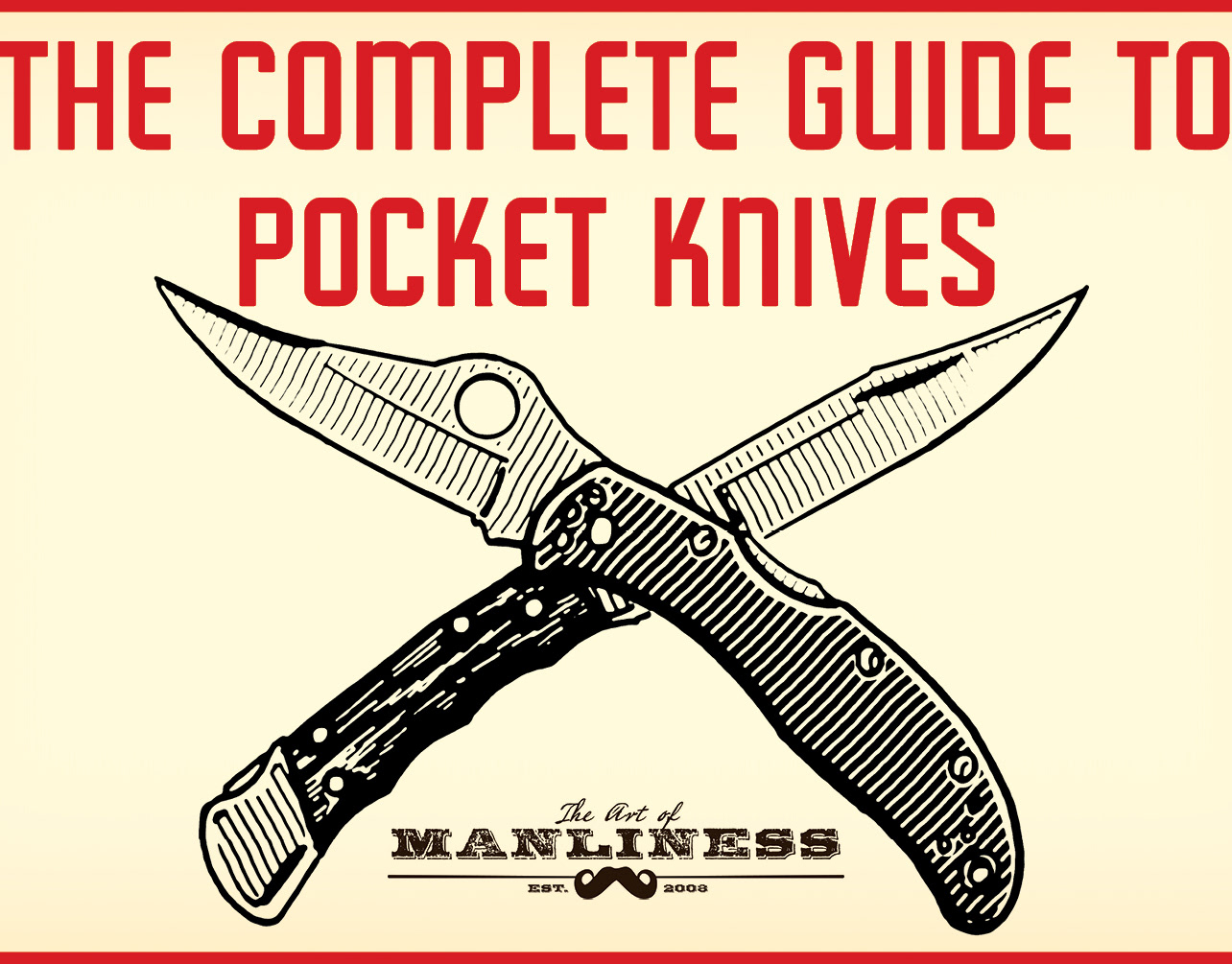
Art of Manliness: Complete Guide to Pocket Knives
February, 2018
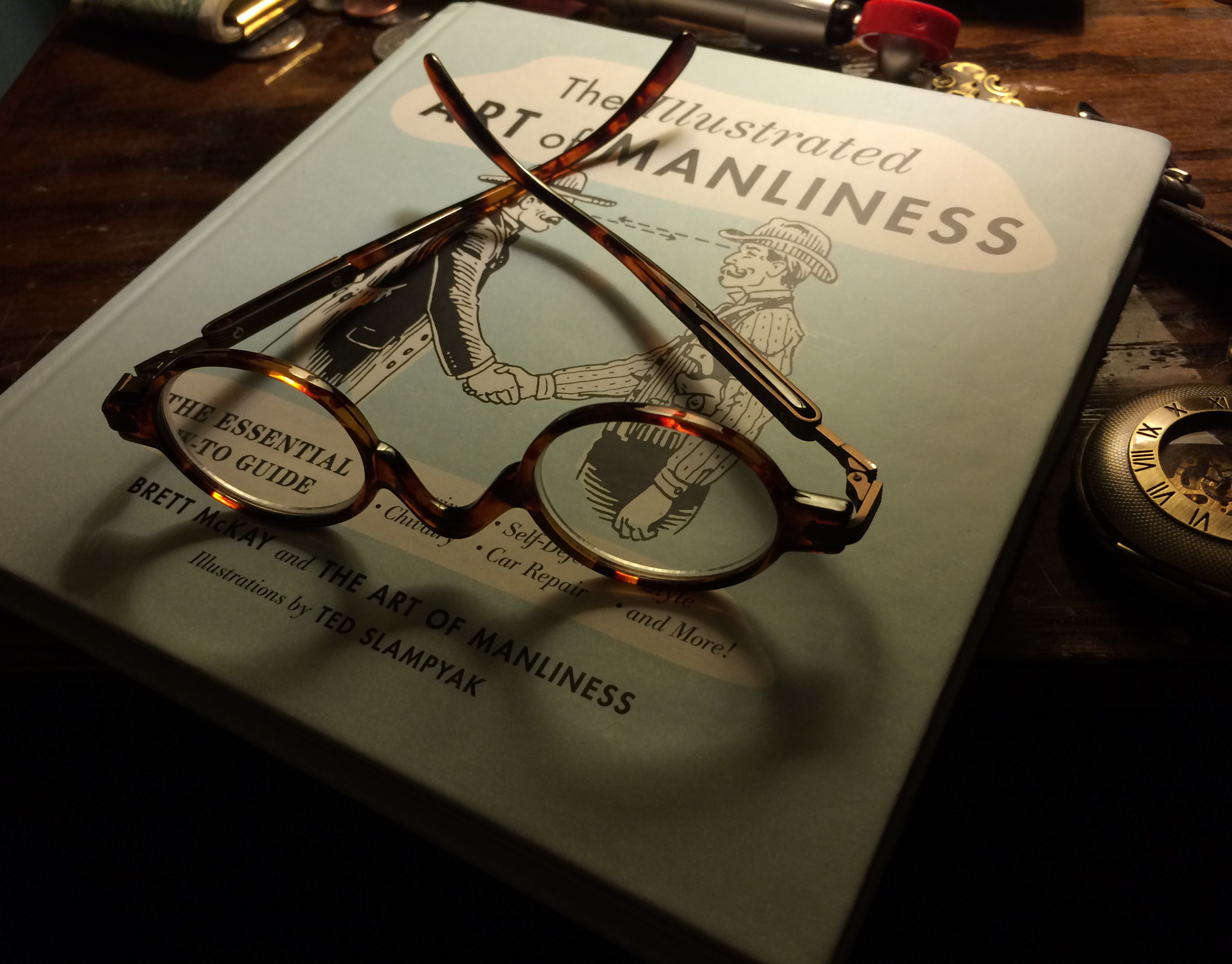
The Illustrated Art of Manliness
December, 2017
Outdoor Life Magazine Illustrations
December, 2017
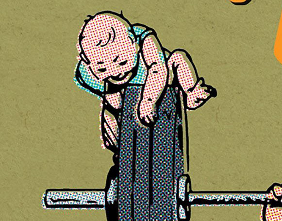
Toddler Survival Guide
December, 2017
Popular Mechanics Illustrations
December, 2017
Heavy Lifting book cover illustration
December, 2017
Ditch Safety Booklet
December, 2017
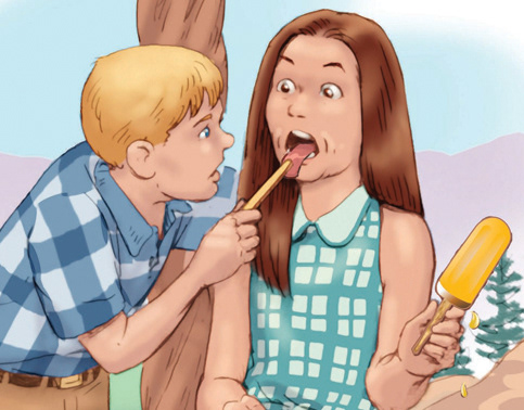
Jack & Jill Illustrations
December, 2017
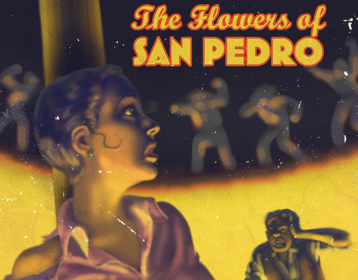
Jazz Age Vintage Covers
December, 2017
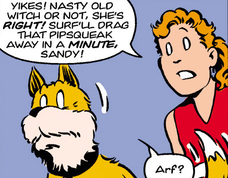
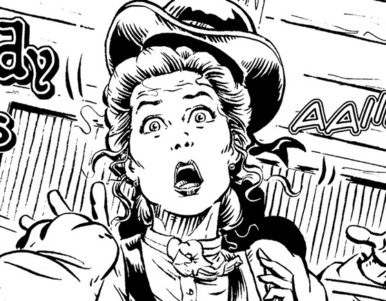
(Little Orphan) Annie Newspaper Strip
March, 2012
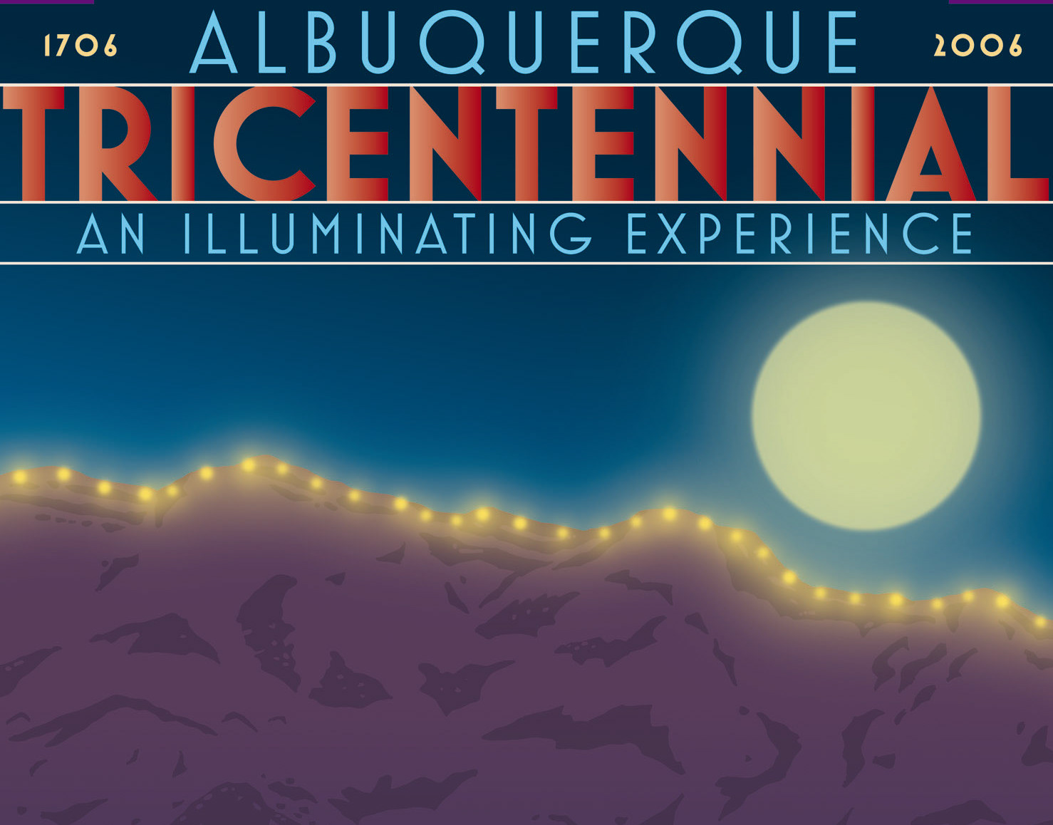
Albuquerque Tricentennial Poster
March, 2012